MakeMyTrip
MakeMyTrip
Rethinking the Bus Booking Experience for Women on MakeMyTrip
Rethinking the Bus Booking Experience for Women on MakeMyTrip

Context
MakeMyTrip is India’s largest online travel platform and one of its most trusted brands. As someone who has solo-traveled across India, I noticed something missing in the bus booking experience. The flow was smooth, but for women traveling alone, it lacked reassurance.
I spoke to colleagues, friends, and relatives who frequently travel by bus, and their experiences echoed mine. That led me to dig deeper and speak with real users to understand the gap.
Over 12 months, this initiative improved women’s booking completion rate by 12%, all without a full redesign.
Duration: 4 weeks
Role: UX Designer & Researcher
Tools: Figma, Miro, Google Forms
Problem Statment
The challenge was to create a more personalized and trustworthy journey using existing data without introducing heavy redesigns or tech dependencies.
We decided not to redesign everything, but build trust throughout the booking funnel — through subtle, meaningful cues instead of flashy features.
This project wasn't about gimmicks. The intent was to create real, data-backed changes that make women feel safer while keeping the tech effort minimal.

We talked to our users
To understand what really happens, I conducted ten semi-structured interviews with women aged 19-45 who travel by bus using MakeMyTrip app. Most participants trusted the platform’s convenience but not the actual experience of the journey.
These conversations revealed that safety concerns rarely appear as direct complaints. They surface as small moments of hesitation, double-checking, or backup plans. To capture these patterns, I created three representative personas that reflect our primary users.

Aditi, 32
The Weekly Commuter

Ritika, 24
The solo traveler

Rekhaben, 43
The Homemaker
Competitor Analysis
Before deciding what to build, I analyzed how other platforms addressed safety for women travelers. I compared major players like Abhibus, RedBus, and Paytm, focusing on visibility, personalization, and reassurance cues within their bus booking experiences.
This analysis helped us identify what competitors lacked and see an opportunity for MakeMyTrip to build trust and safety directly into the booking flow, rather than treating it as an optional add-on. Below is a comparison of key women-first features across competitors:

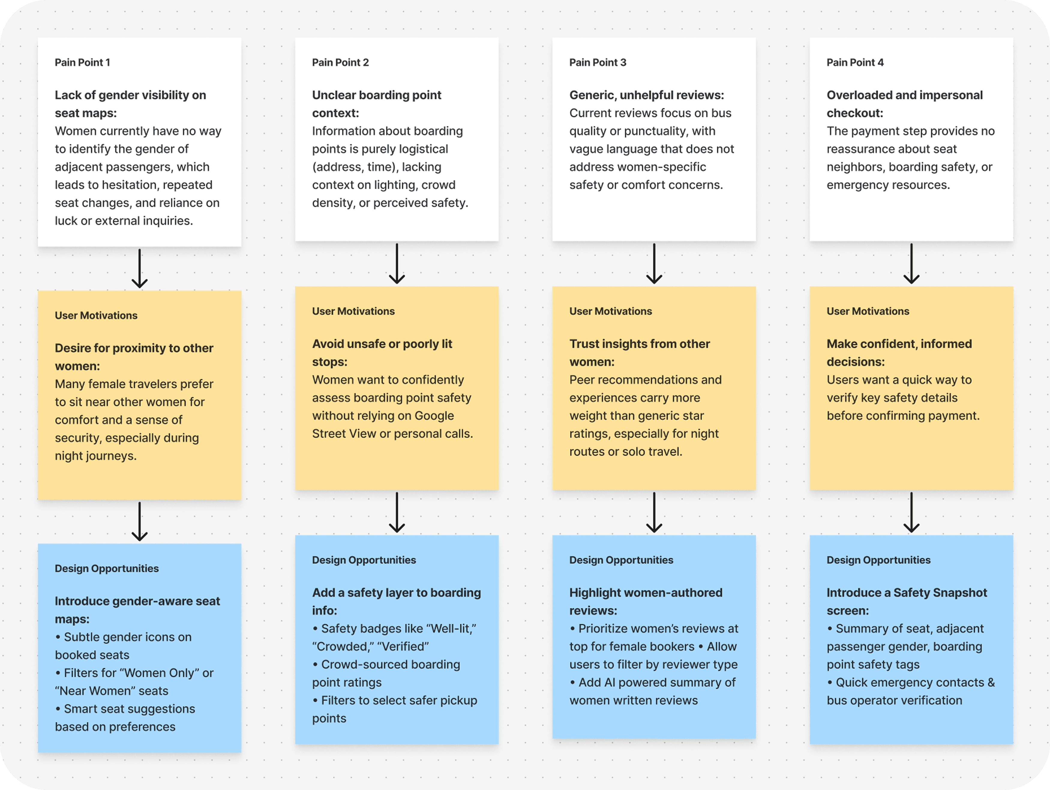
Finding the trust gaps in current flow
What seemed efficient from a design standpoint felt uncertain in practice. The system handled logistics well but failed to provide emotional reassurance, the kind of trust that makes a late-night journey feel safe.
Here’s what we discovered early on:

Seat map lacks gender visibility
I first tried a blue-heavy palette that leaned into a “reliable, utility” look.
What worked:
It blended well with the product UI and felt safe.
The streak metaphor was easy to understand and visually dynamic.
Why we did not choose it:
It did not stand out in the overall flow and failed to signal any sense of “reward” or “premium value.” For a loyalty program, the branding needed to feel more special and aspirational, not just functional.
Boarding points and Drop points lack real-world context
Next, I explored a red-forward route that used a gift symbol to echo the idea of consecutive trips and rewards.
What worked:
The gift as reward metaphor was easy to understand and visually dynamic and red was a great contrast to the current blue heavy UI.
Why we did not choose it:
In practice, the red + gift treatment felt way too similar to redBus, a direct competitor. It risked brand confusion and did not give MMT a distinctive loyalty identity.
Safety information is scattered
I also experimented with a gold-centric palette, using gold as a metaphor for “reward,” “upgrade,” and “status.”
Why it was chosen:
Gold immediately felt premium and celebratory, and naturally inspired the name “MMT GOLD.”
It also paired naturally with the Diwali launch, a time culturally associated with celebration.
The colour helped the program feel special without relying on heavy cues, reinforcing loyalty as something to be unlocked over time.
Brainstorming & Ideation
Based on insights from user interviews, I began examining the existing app screens closely and reimagining them to accommodate a more women-centered booking flow. This hands-on exploration helped identify where subtle design shifts could make the overall experience safer, clearer, and more empowering for women travelers.
Integrating Women-First cues into the existing flow
I went through every screen to identify the right moments to educate and empower women about the new features designed for them.
We wanted to first introduce the feature and get consent to personalize a safer experience. Then, we guided users to filter buses and explore safety cues. Below is the existing flow, displayed with placeholders for the Women-First elements:


Final Designs
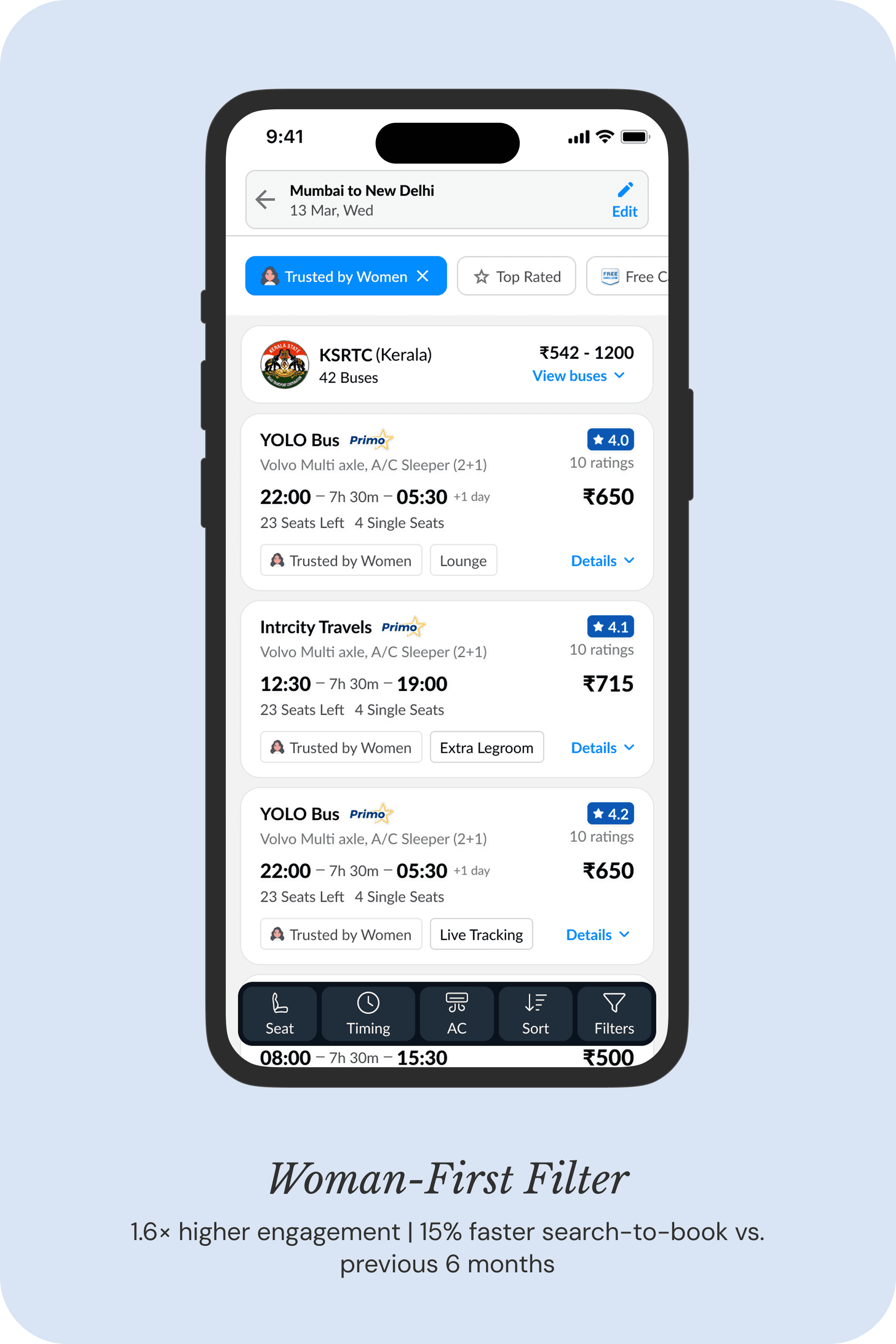
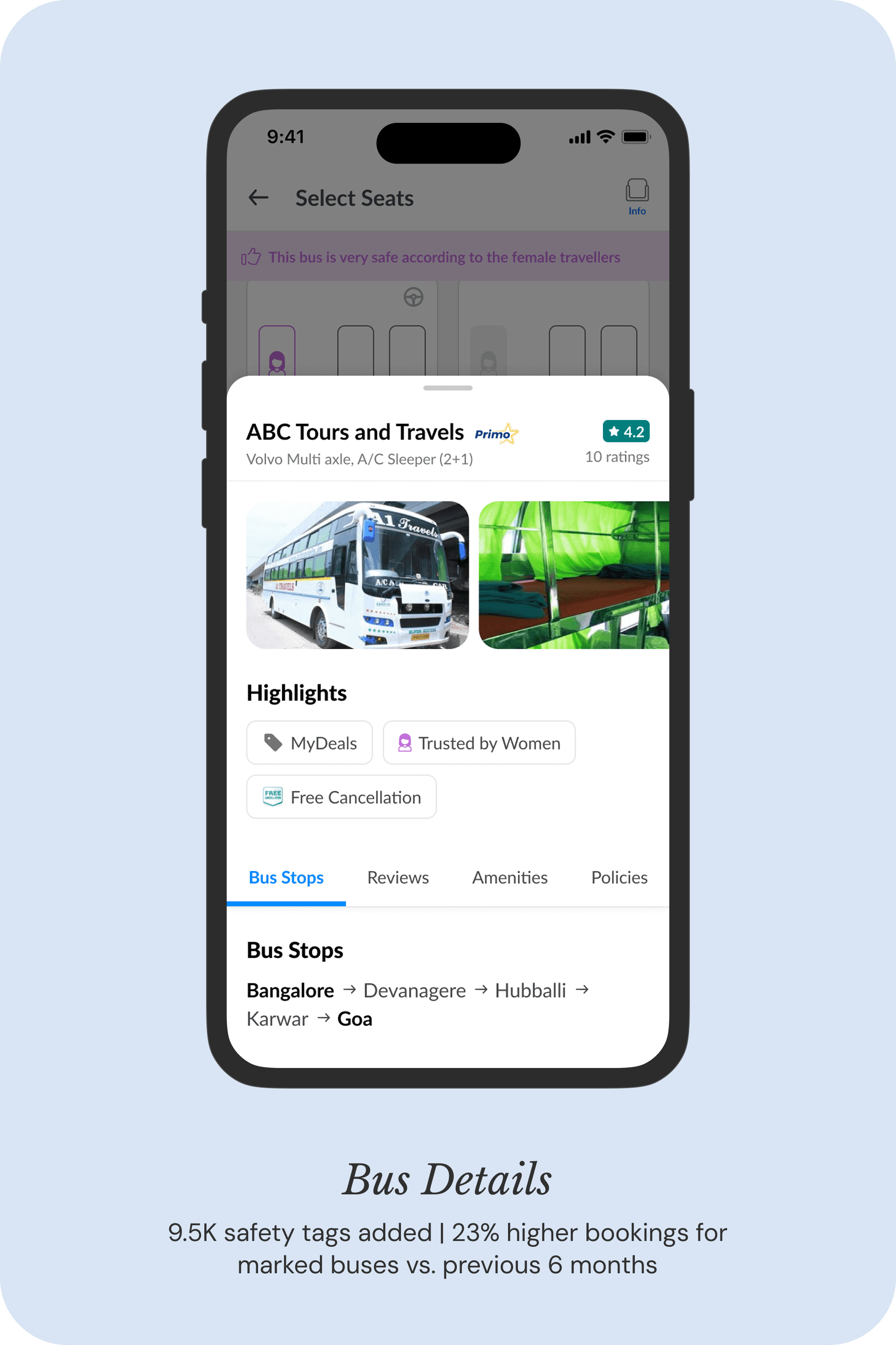
The Women-First flow was designed to make safety feel effortless. Instead of adding new pages or disrupting the booking journey, we layered trust cues into existing screens from discovery to post-booking.
Each touchpoint was enhanced with subtle details like gender visibility on seat maps, safety-tagged boarding points, and personalized bus recommendations trusted by women travelers. The result was a familiar experience that now felt more transparent, contextual, and reassuring.
Below are the final design screens, along with data-driven impact metrics from our first 30 days of rollout:


Phone Version coming soon…